
UX Writing — Create better experiences with better content
May 24, 2021
Imagine a website or an app with no words. If it wasn’t for the logo, would you be able tell what this page is about? Would you know which button to click? Where navigation would take you? What you’re supposed to write in the search bar? No matter how good-looking an interface is, without words users will simply not be able to accomplish any tasks in it.
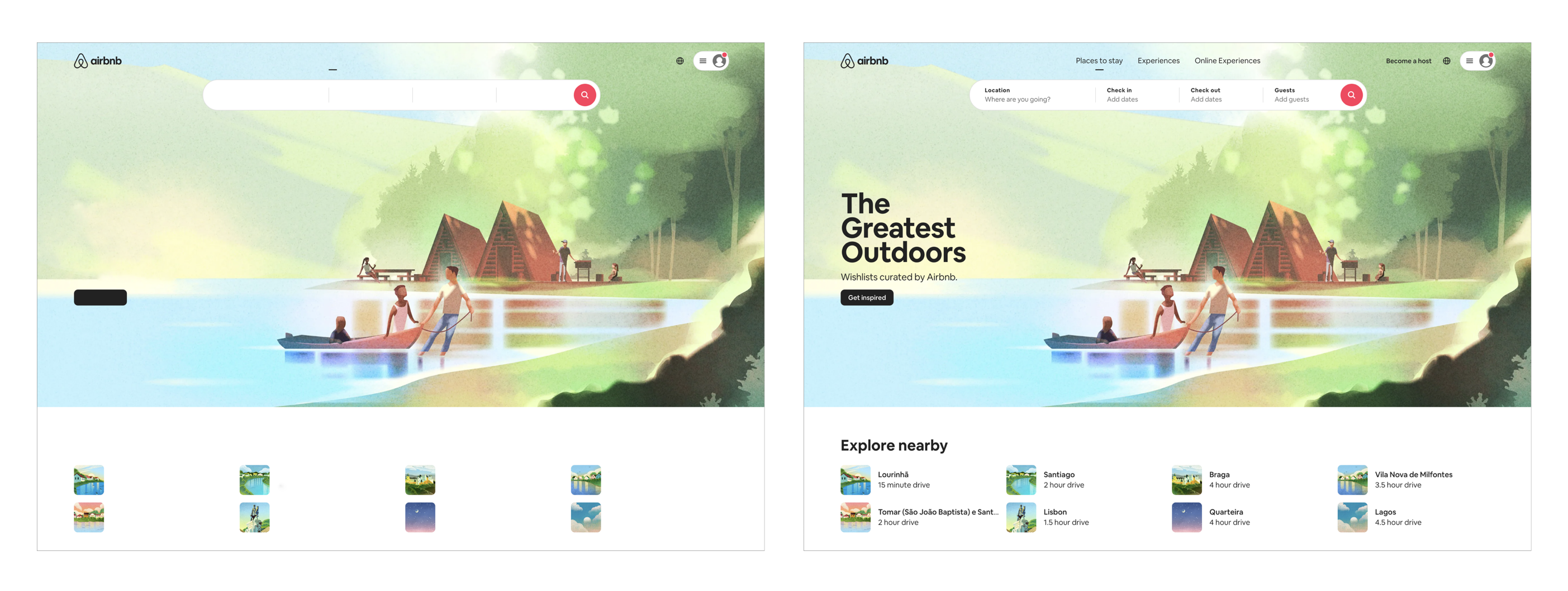
If Airbnb’s website had no words (inspiration from “Reminder: Design is still about words” by Mig Reyes)
Content can’t ever be dissociated from the UX. It’s as important as style, layout or structure. Dan Brown, co-founder of the design firm EightShapes, explains:
“When a product or website has bad content, it has a bad experience. If the content is good but, say, the navigation makes it difficult to access the content, the product also has a bad experience. So if you don’t pay enough attention to the content, then you’re not really designing a product!”
What is UX Writing?
UX writing is responsible for all the text a user sees when interacting with a digital product. The goal is to help users complete their tasks in the most comfortable and effortless way possible.
If users don’t understand how to complete the necessary tasks they will end up confused and frustrated. They will most likely leave the app or website, abandon the shopping cart, quit sign up, give up the booking process. This will of course lead to major business losses.
To avoid all that, UX copy needs to be clear — users must be able to understand exactly what you mean — and simple — so that they can interact intuitively with the product — helpful and appropriate for each situation.
UX copy includes materials such as:
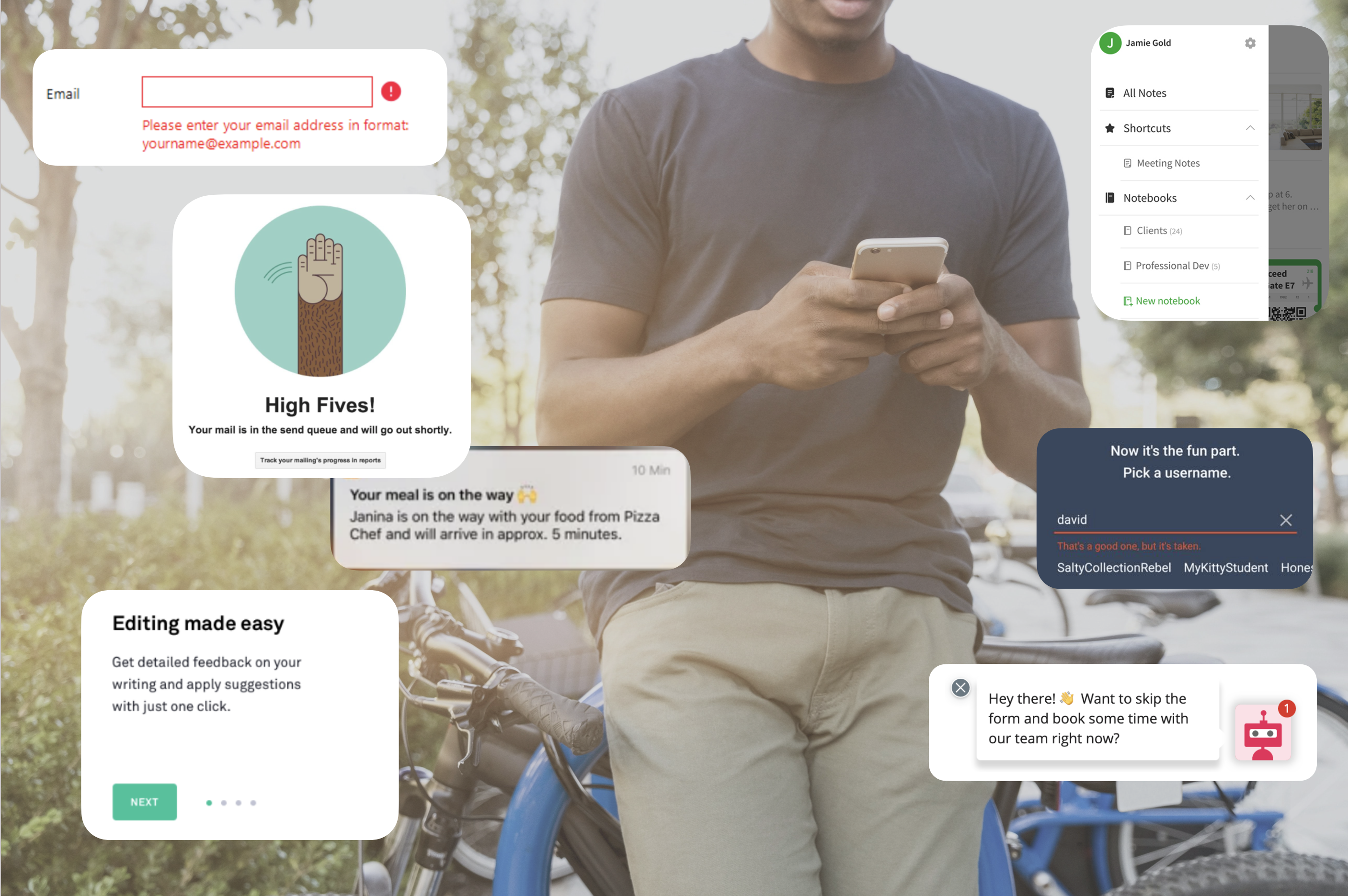
- Onboarding text
- Error and success messages
- Button texts
- Pop-up messages
- Contextual help and tooltips
- Legal notices
- Form fields
- …
Since text plays such a big part in the user experience, UX writers should collaborate with design teams right from the start. Receiving a design and then add copy at the last minute will not do the trick.
In Writing is Designing, Michael Metts and Andy Welfle say:
“The writer should be creating words as the rest of the experience is developed. They should be iterative, validated with research, and highly collaborative. Writing is part of the design process, and writers are designers.”
Defining your brand’s voice and tone
“Voice is who you are.
Tone is how we respond to different situations.”
(Michael Haggerty-Villa, Intuit)
Voice — who you are
Voice is the brand’s personality, the style that guides how the brand speaks and writes. It should reflect the product’s character, not only on the website or app, but in everything the brand produces, be it brochures, business cards, social media posts, TV ads, etc.
To define the brand’s voice you should think about the core function of what your product does, what makes it special and different from others. It should engage the intended audience or motivate them to become users/customers.
Airbnb says their voice “is the extension of our brand and personality within the product, and it’s the foundation of everything we write.” They have a clear idea about what their voice is, defining it as “straightforward, inclusive, thoughtful, and spirited.”
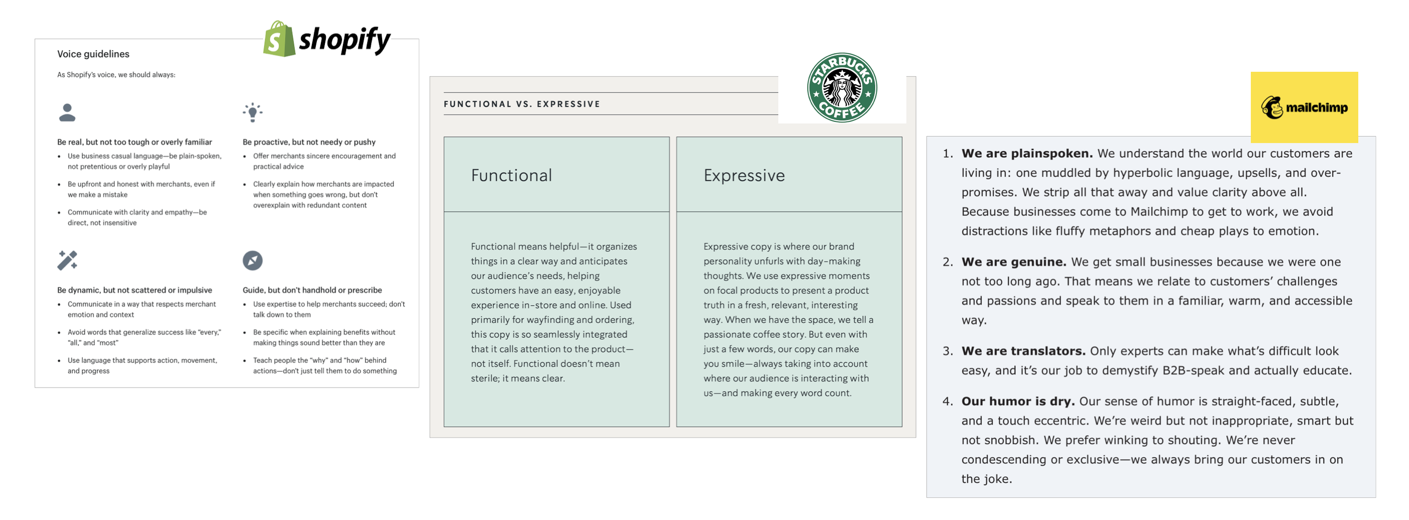
Here’s how Shopify, Starbucks and Mailchimp define their voice.
Tone — how you respond to different situations
Like how it happens with us humans, the tone we talk in changes depending on what we’re saying or on the situation we’re in. The same happens with a brand’s tone. It’s the way the brand’s voice is expressed in different contexts.
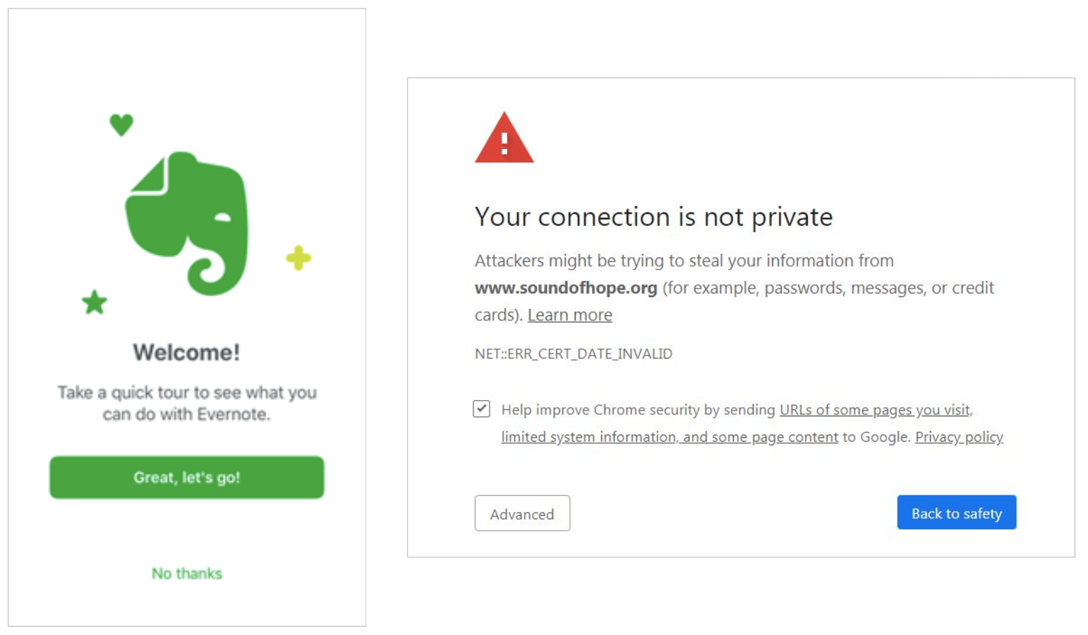
If your user is new to the product you may use a motivational tone — as we see in Evernote’s onboarding experience. If they’re trying to enter a website and the message “Your connection is not private” shows up, they’re probably feeling frustrated and apprehensive so you should consider using a supportive tone while providing a way to help them solve the situation — the “Back to safety” button in Google Chrome.
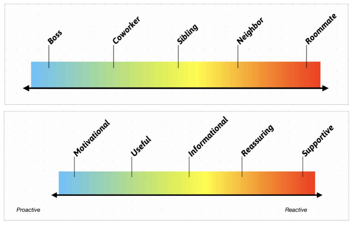
Source: “Voice and Tone for Interfaces” slide decks by Michael Metts
In the workshop “Voice and Tone for Interfaces” at UXLx 2019, Michael Metts explained how UX writers think about tone in a spectrum upon which you pick a tone to best respond to the user.
Bottom line — While voice remains consistent, tone is changeable.
How do you keep it consistent?
Each writer has their own writing style, their voice and tone. If Mary from the Marketing team writes a blog post using a more formal tone, and Josh from the UX writing team likes to sound more like your next-door neighbour, users will notice there’s something off. If different writers craft copy for the same brand, it becomes even more important to create consistency. Aligning strategy and work will make the process more efficient and the product more coherent.
An effective way to keep things consistent is creating and maintaining a content style guide. It consists of a set of standards for the writing and formatting of all an organisation’s content, be it website and app microcopy, social media posts, blog articles, printed advertisement and so on.
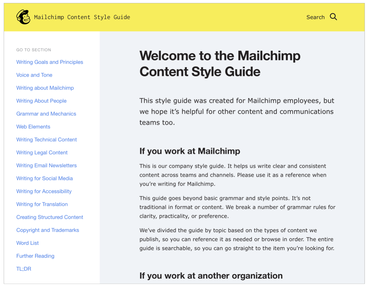
A widely-admired example is Mailchimp’s content style guide intended, as they say, to “write clear and consistent content across teams and channels”. Besides covering voice and tone, they include grammar rules, how to write technical content, how to write for social media, and more.
Other way to maintain consistency is including language as a core element in the organisation’s design system. A design system gathers all the resources the team might need when developing a product in a single place. As Metts and Welfle say, it should include:
- A strategic vision for the product or organisation — design principles and voice and tone guidelines;
- Style guides for words and visuals (colours, abbreviations, capitalisation, for example);
- Design patterns made up of reusable assets and code.
A very good example is Shopify’s design system — Polaris. In the main navigation you can see that one of the tabs is exactly “Content”, which aims to make people learn how to use language to design a more thoughtful experience.
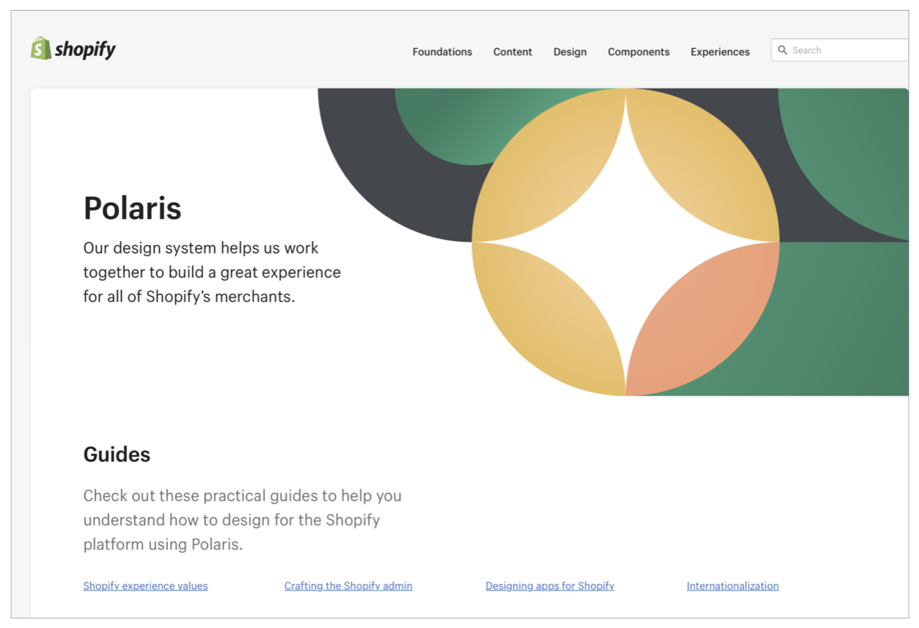
Polaris — Shopify’s design system
Research — the best way to get it right
Before writing a single word, you should focus on understanding. Understanding your users, their needs, how they use the product or service, the language they use. You can achieve that through research.
If you have two hypothesis but you’re not sure which one will connect to your users more, running an A/B test will help you to choose the right words. Interviewing users will help you understand how they talk about the product and its features. By conducting contextual inquiry you’ll observe your users in their own environment and learn from their behaviour, the world they live in and the problems they might be facing. You can then figure out how you can use words to meet their needs.
Another way to get insights about your users and how they use the product is usability testing. If the test includes task scenarios where users need to understand the words, like confirmation screens or error messages, you’ll be able to confirm if what you’ve written is easy to understand and guides them through their tasks seamlessly.
UX Writing and Strategy
Let’s think about CTA buttons. Often there’s a business goal behind them, so the words you choose might be intended to guide users as well as to encourage them to stick around.
UX writers need to understand the business’ overall picture. Working with different stakeholders, like legal departments and support will ensure copy and strategy align with overall company goals.
In a Google I/O talk, Maggie Stanphill, senior UX writer at Google, gave an example from Hotel Search on Google to show how changing two words had an huge impact on the business. By changing “Book a room” to “Check availability” they saw a 17% increase on engagement.
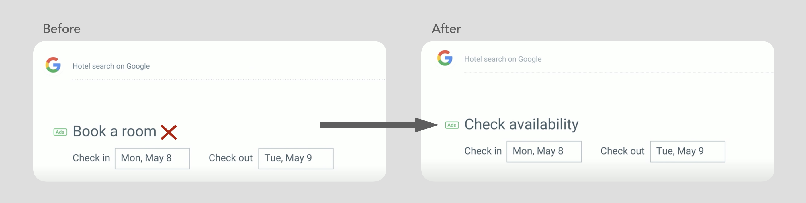
She explains that they found that the first was far too committal at the stage in the decision-making process the user was in. As they were still considering rooms, they wanted to understand what dates were available and what prices were in that date range. Switching to “Check availability” matched exactly the users’ mindset at that stage.
UX Writing Best Practices
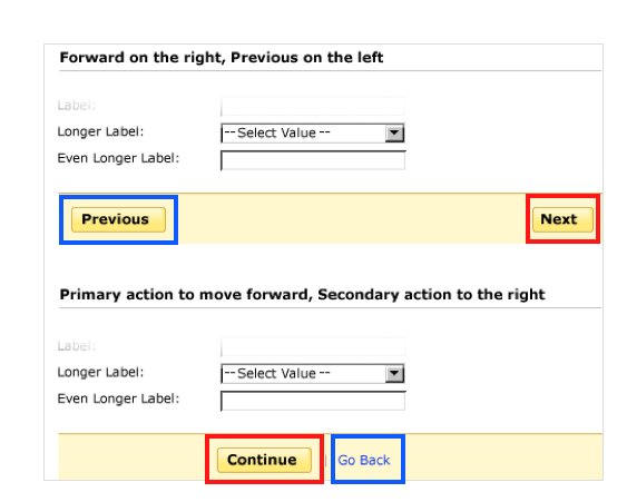
Be consistent
If you choose to label the button that will take your users to the next page “Next”, don’t write “Proceed” or “Continue” in the buttons that originate the same action. Naming the buttons differently might lead users to think they will get a different result.
Be clear and concise
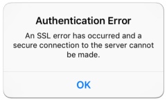
The last think you want is your users to think “I don’t understand!” or “what does this mean?” Everything you write should be clear enough for everyone to understand. Unclear text can misguide users and make them take unwanted actions.
One of the things you’ll want to do is to avoid technical jargon, and use familiar and easy-to-understand words instead. It’s particularly important to avoid jargon in error messages. Who knows what an “SLL error” is? Now, if you tell me “Sign-in error: You entered an incorrect password” I’ll understand it much better.
Good UX copy must also be concise, not only because you’ll often have interfaces with space restrictions, but because users can read quicker and easier if the sentences and paragraphs are shorter. The truth is most users don’t read web pages word-by-word. They simply scan through the page looking for what’s valuable to them. Using elements like relevant headings, highlighted keywords, bullets lists or columns will make your content more scannable. A Jakob Nielsen usability test study showed that concise, scannable and objective copywriting resulted in 124% better usability.
Use action words and the active voice
If a task requires some kind of action by the users, use action verbs or words in the beginning of the sentence to make it clearer and easier to read.
❌ You need to log in to download this video.
✅ Log in to download the video.
And let’s be honest. The passive voice is boring and will most likely make your users yawn. It makes communication feel unnatural. Look at this example.
❌ The Download button needs to be clicked.
✅ Click the Download button.
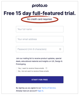
Guide your user
When your user in a process that entails some kind of transaction, specially when money is involved, if they’re not clearly informed about what will happen if they press certain buttons like “continue” or “next”, they’ might get anxious and get second thoughts about proceeding.
Microcopy can minimise any doubts the user might have when going through a registration or check out process. Proto.io does this by reassuring users they will not have to provide their credit card details to access the 15-day trial.
The right words can also help to reduce other fears your users might have — being spammed, losing their data, or having it being misused or sold, hidden charges.
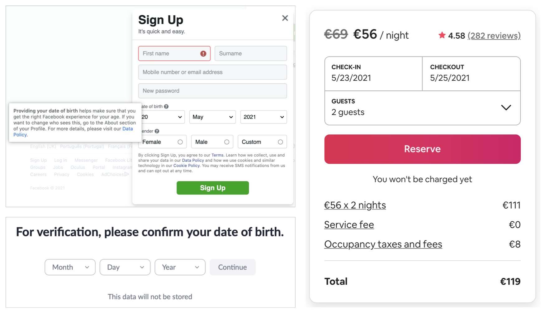
Facebook eases any fears users might have with providing their date of brith explaining why they ask for that information. Zoom asks the users to confirm their date of birth for verification but reassures users that the data will not be stored. As people tend to like to have a complete view of pricing and other details before committing to payment, Airbnb alleviates users’ fears with clicking the button “Reserve” during the booking flow by letting them know that they won’t be charged yet.
Airbnb provides indications in each search box about what kind of information the user is supposed to add to start their search. Instead of leaving it blank, they use microcopy to guide the user.

Make errors less frustrating
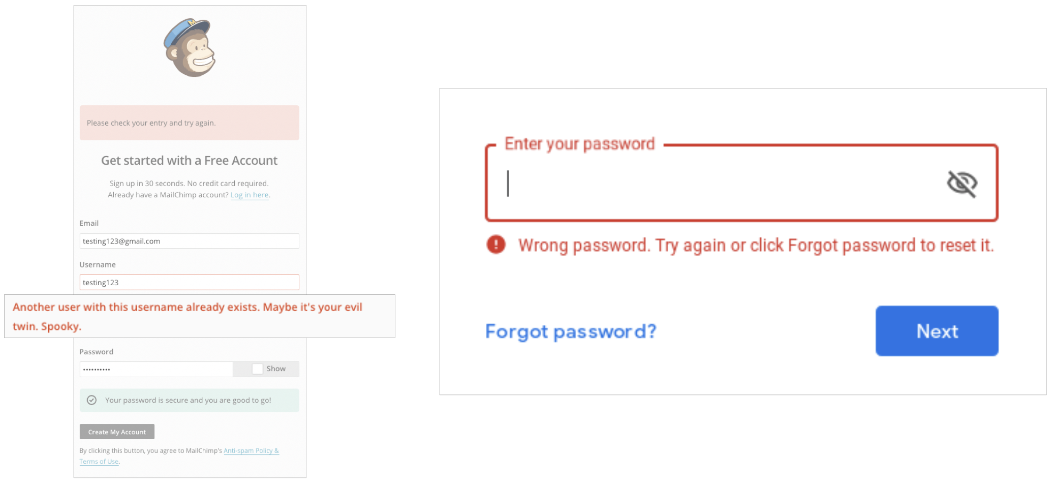
Error messages can often let the user be frustrated. That’s why they should explain the issue and point out the solution. Depending on the company’s tone, users annoyance can be eased with a bit of humor, as we see on the Mailchimp sign up form, or straightforward like Google. Here they explain the issue — “wrong password” and provide two ways to overcome the situation — whether “try again” or “click Forgot password to reset it.”
A 404 page is one of the worst things that can happen to a user while browsing a website. Ending up in a page that doesn’t exist is frustrating and can lead to a bad experience. However, the right words can save the situation and, if put together with graphics, even create a funny experience.
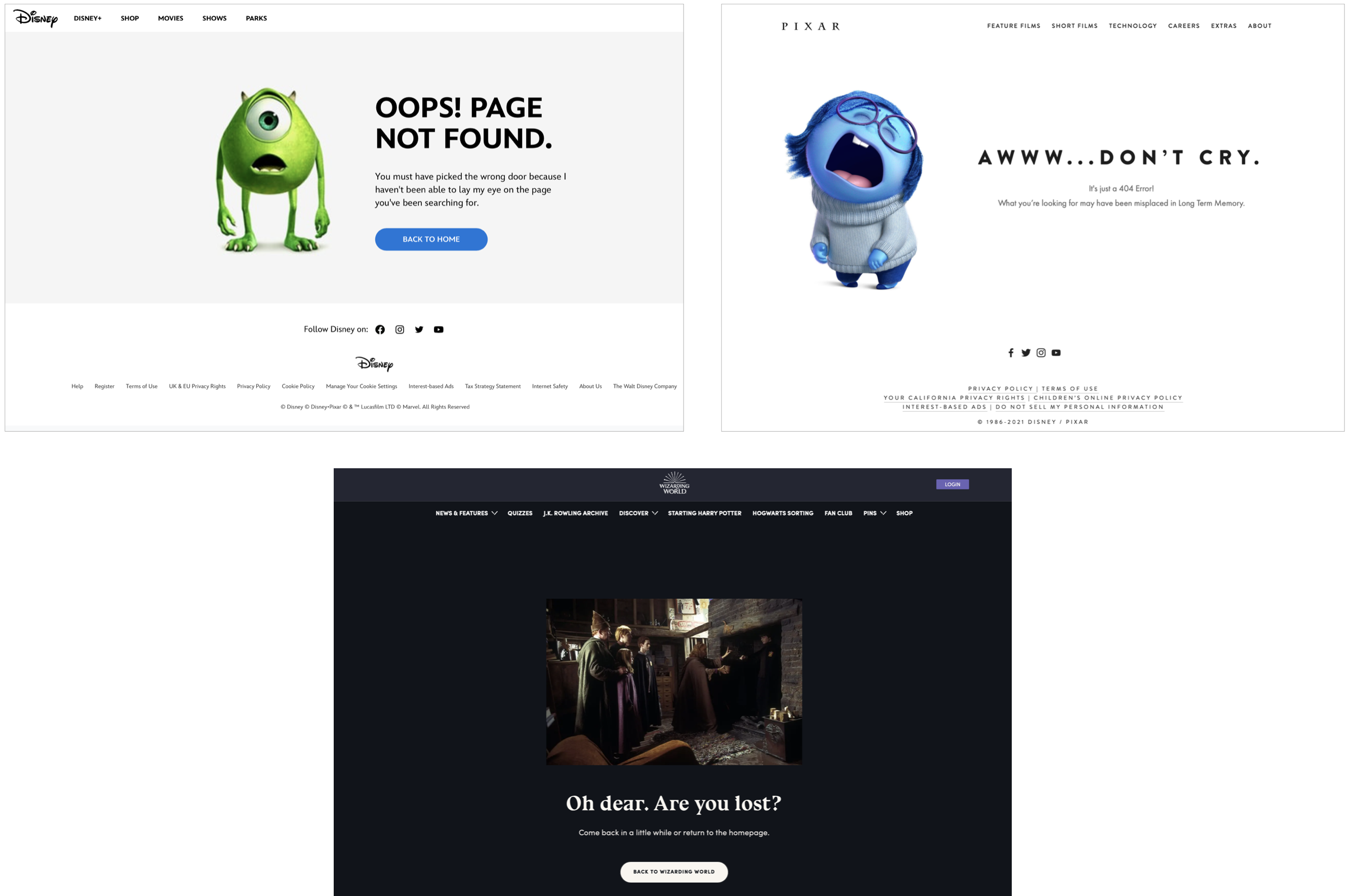
Here we can see three great examples of 404 error pages. Disney takes Mike, one of their characters, and makes a clear reference to the movie Monsters, Inc. — “you must have picked the wrong door”. Pixar uses Sadness from the movie Inside Out and allies it with a matching copy. The Wizarding World website takes a scene from one of the Harry Potter movies where Harry uses Floo powder to transport himself to Diagon Alley but ends up lost.
Be conversational
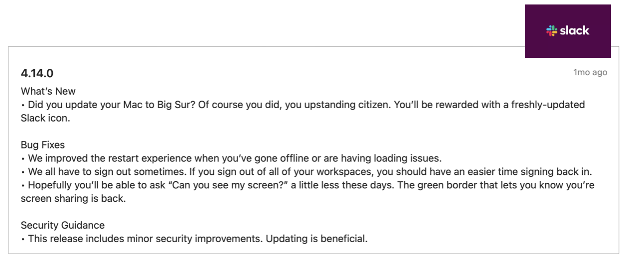
Users don’t want to feel like they’re talking to a machine so you want your copy to be human and authentic. Slack is the perfect example. Even in something with such a technical nature like software updates, they make it feel like a conversation between real people, involving us in their copy — “Of course you did, you upstanding citizen.”
Words matter. So make every word count.
A bad choice of words in a CTA button can be the reason users don’t proceed to checkout. Not explaining why you need the user’s date of birth might make them feel suspicious about sharing their data. Technical terms will confuse users. Error messages that are unclear and don’t provide a solution will frustrate users.
UX isn’t only about design. It’s about everything that contributes to a positive user experience. UX writing goal is to create clear and useful texts that help and guide users as they navigate through a website or an app, making sure they don’t get confused or frustrated.
Well-crafted words that stay true to the brand’s voice help users know how to successfully use a product, improve their experience, raise engagement and conversion, and ultimately originate more business revenue.
Thoughtful, consistent content is a core element of a well-designed user experience.
In Polaris, Shopify’s design system
Learn more with the experts
If you wish to know more about UX writing, we strongly recommend a close read of the following:
- Writing is Designing by By Michael J. Metts & Andy Welfle
- Strategic Writing for UX by Torrey Podmajersky
- Conversational Design by Erika Hall
- Content Strategy for the Web by Kristina Halvorson
- Nicely Said: Writing for the Web with Style and Purpose by Nicole Fenton and Kate Kiefer Lee
- Don’t Make Me Think: A Common Sense Approach to Web Usability by Steve Krug
- Writing for Designers by Scott Kubie
Need some help with your product’s copy?
At Xperienz we can help you to create a consistent message, voice, and style so that the content created across teams conveys the same business goals, fulfils the right purpose and reaches the right audience.
Tell me moreRelated Articles
-
A glimpse into the future — Here’s the UX design trends we expect to dominate 2024
Emerging technologies and tools constantly influence the way people use the Internet and interact with digital products. And as user behaviours and preferences evolve, designers must keep up with new tools and solutions to deliver interfaces and user experiences that cater the needs of an ever-demanding audience.
-
Design for a better world - How working together and applying design approaches is improving people's lives
9 November is World Usability Day 2023. This year's theme is Collaboration and Cooperation, which intents to focus on how we can work together to create solutions, both globally and locally, to solve the world's biggest problems.
-
Be an Agent of Change - Check these resources to help you build more ethical designs
The role of today's designer goes far beyond simply creating beautiful interfaces and experiences. You can no longer design without considering the consequences of how what you're creating impacts individuals, society and the world.
-
E-commerce and Accessibility - Creating an inclusive online shopping experience
Now it’s the time for online stores to improve their website accessibility and ensure they offer an inclusive experience for everyone.
-
The future is today — How can we leverage AI to improve our UX Design work
AI has now become a big part of several areas of our lives, and UX Design is no exception. It’s actually becoming more and more applicable to the UX design process.
-
Conducting usability testing with people with disabilities
Drawing on our experience conducting usability tests with users with disabilities, we’re sharing a few things to take into account when planning and conducting research with people with disabilities and make sure everything goes smoothly and you can collect valuable insights.
-
Accessibility Compliance App - by Xperienz. A useful tool when fixing accessibility errors
To simplify the presentation of the accessibility evaluation of websites, Xperienz has created the Accessibility Compliance App. We start by doing a content inventory in which we collect all the pages of the site. Then we evaluate each page and list all the aspects that need to be fixed.
-
What does the UX future hold? - Here's the UX Design trends we expect to dominate 2023
Businesses must stay up to date on emerging user experience and interface trends so we've selected 7 top trends that are already making, and will certainly continue to make, an impact on website and app development.
-
Raising Awareness for Web Accessibility [Infographic] — International Day of Persons with Disabilities
Last December 3 we celebrated the International Day of Persons with Disabilities. To help promote a more accessible Web we’ve put together an easy-to-digest infographic about Web Accessibility.
-
Why hiring external UX services even when you have an in-house UX team?
Even if you have an in-house UX design team, there might be times when additional resources and professional know-how can be useful. Bringing in an external UX team might be exactly what you need for your company to excel in all projects.
-
Health and UX: when design has a life-saving potential
A good experience with healthcare technology and services, that is both useful, accessible and reliable, can make a huge different in improving peoples’ well-being, as well as the work of healthcare professionals.
-
Trust — Breaking or Building it Through Design
Trust is more valuable now than ever. 68% say trusting a brand they buy or use is more important today than in the past (Edelman, 2019). We live in an ever-growing digitalised world, where we increasingly interact and transact online. At the same time we constantly crave for trust-based interactions in digital environments. Questions like "Will the personal data I provide here be misused?", " Will my email be used to spam me incessantly?" or "Do I really want to share my bank details to a website I've never heard about?" have certainly come to our mind more than once.
-
Creating accessible digital experiences
Accessibility is of major importance for organisations who deliver web products and tools. Accessibility issues can affect not only a website’s usability for people who have disabilities but also for those who don’t. By offering accessible products, organisations will show they are inclusive, reach a wider market, be legally compliant, and offer a better user experience. For everyone.
-
"You're on Mute" - Lessons Learned After a Year of Conducting Remote User Research
After more than one year of engaging with users remotely, we want to reflect on the pitfalls of remote user research, share some of the lessons we learned and reflect on what’s going to be “the next normal” after Covid’s impact.
-
Quick & Dirty User Research
Tight timescales and budgets are no excuses to ditch user research altogether, specially when we all know it’s essential to make sure you deliver easy-to-use products. Quick and dirty research is a great way to get user insights fast and on a budget.
-
How bad metrics are hurting your business and your users’ experience
Businesses are deceiving themselves and annoying their customers as a consequence. They do so when they apply biased surveys only expecting to confirm what they want to hear.
-
UX Writing — Create better experiences with better content
Imagine a website or an app with no words. If it wasn’t for the logo, would you be able tell what this page is about? Would you know which button to click? Where navigation would take you? What you’re supposed to write in the search bar? No matter how good-looking an interface is, without words users will simply not be able to accomplish any tasks in it.
-
10 Bad User Research Practices You Will Want to Avoid
Some might think user research is as simple as watching people perform a few tasks on a website or asking them a few questions, but user research is definitely not walk in the park. Let’s go through some of the mistakes that can arise when planning and conducting research.
-
Responsive Illustrations
Can the same illustration be used the same way on a desktop screen, on a tablet or on a smartphone? How is it possible to make them look great on every screen without losing quality or the idea the brand is trying to convey?
-
UXLx Masters — Wrap-up
From 10 to 13 February attendees from 25 countries and 14 world-renowned UX experts joined online for 3 days of learning. The programme included 12 live masterclasses, 2 keynotes, 2 live podcasts, and more.
-
Remote UX Research — our selection of the best online tools to conduct it
As a company that focus on UX research and design, we gathered some of the best tools to conduct remote research and combined them, with our personal knowledge, in this article.
-
Health Habits during the Lockdown
Xperienz, along with 15 other agencies from the global network of user research companies UX Fellows, conducted an intercultural study in 15 different countries about health and wellbeing during the lockdown caused by the current pandemic situation.