How can insurance companies make their digital products more accessible?
December 18, 2023
Apart from struggling to understand some of the technical language of the insurance policy, customers probably go through the process of purchasing an insurance rather smoothly. While that might be true for most customers, it’s most certainly not for all, particularly those with different abilities.
Millions of people who live with a disability struggle to access important information online because websites and apps are built with major content and technological barriers. And insurance websites are not an exception.
For these customers to understand and purchase a life, home, auto, health insurance, insurance leaders must ensure digital products are designed and developed with specific accommodations.
Addressing digital accessibility will ensure easy and straightforward interactions for all customers, with or without disabilities. And that might just be the difference between making them choose you, or shop around for an insurer who does.
Why should insurers care about digital accessibility?

From legal to moral, there are multiple reasons why insurance companies should care about making their websites and apps more accessible.
Non-compliance can cost you
From June 2025, the European Accessibility Act makes it mandatory for large private companies operating within the European Union to comply with accessibility standards. The act covers products and services considered most important for people with disabilities, e-commerce included.
- provide information about the service, its accessibility features and facilities;
- make websites and mobile devices easily accessible;
- support systems, such as help desks, call centres and training to provide information on accessibility;
- apply practices, policies and procedures to address the needs of people with disabilities.
Companies who don’t comply will face the penalties established by the Member State where they’re operating. Penalties also imply effective remedial action.
In countries like the US, where discrimination laws are enforced since 1990, non-compliant companies have already faced lawsuits filed by frustrated customers with disabilities who got tired of having to search an alternative. E-commerce websites and apps are generally the biggest targets, with over 74% of lawsuits filed in 2021. Besides the expensive legal fees and fines, such a lawsuit can damage your company’s public image. In the end, when you could have just spend the money remediating your website, you’ll pay a far higher price.
Positive return on investment
If people with disabilities can’t access information about the insurance options you offer, they’ll certainly look for a more accessible competitor.
82% say they would often return and spend more with a company that provides an accessible online experience. (Click-Away Pound)
Companies without accessible sites are losing $6.9 billion a year to competitors whose sites are accessible. (US Department of Commerce)
However if they have no major trouble getting a quote, filling in claims or getting the appropriate help from your customer service, they will advertise it to their friends, family, communities and institutions, who tend to support and make business with companies that create accessible digital products.
Google recognises the importance of everyone being able to browse independently, so their algorithms value and benefit accessible pages. This improves your search engine optimisation (SEO) rankings, and consequently drives more traffic to your website and app.
Any brand that shows their commitment towards making everyone feel included in society tends to have a more positive image and visibility. And inclusivity has never been more important.
57% of consumers are more loyal to brands that commit to addressing social inequities in their actions (Deloitte).
It’s important you make it clear to customers that you make accessibility a priority. How so? Having an accessibility statement on your website will show them you’re making accessibility a priority and considering everyone’s needs.
Designing for accessibility benefits all users
Accessibility goes hand-in-hand with usability. Accessibility features also help most users without disabilities to navigate the web more effectively, and provides them with options useful in different situations:
- as people age, they’re more likely to experience age-related conditions that affect their ability to interact with digital products;
- people with temporary disabilities — if a broken arm prevents you from using the mouse, you’ll need the website to be properly developed to be used with keyboard only;
- people with situational limitations — if you’re trying to browse a website in bright sunlight you’ll need it to have an appropriate colour contrast, or if you’re hearing a video in a noisy environment you’ll need it to have captions so you can understand what’s being said.
Common accessibility barriers — a few examples from insurance websites
Missing or inadequate alt text
Descriptive alt text is what allows people who are blind and use a screen reader to navigate a website to understand what the images displayed are supposed to illustrate.
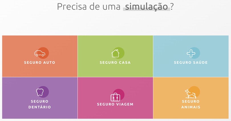
In the example bellow, the icons are used to visually illustrate each type of insurance. Although icons are images, they don’t require alt text as they’re purely decorative. A screen reader user will listen “link icon carro seguro auto”, “link icon casa seguro casa”, and so on. In this case, the right practice would be to give images an empty/null alt to avoid redundancy.
Empty links
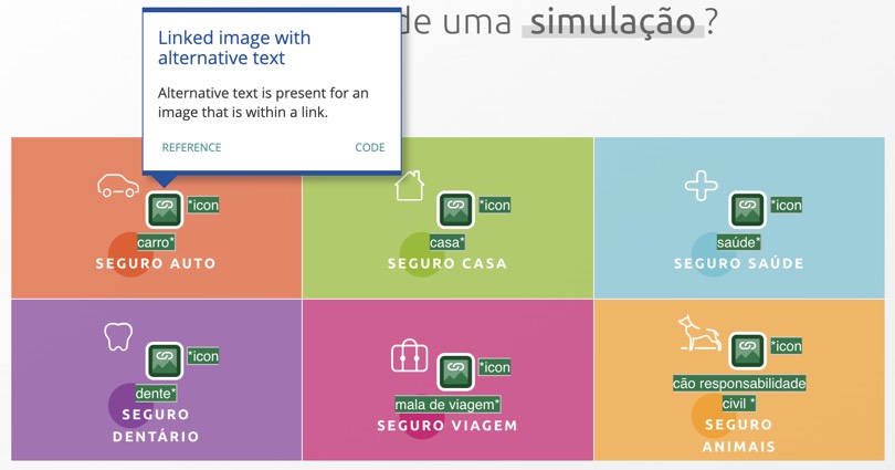
When customers are looking for a health insurance one the first things they do is getting a quote from several insurers to compare offers. That normally involves filling in a form.
Let’s look at this example from one of the biggest insurance companies in Portugal. This is the first step to get a quote, where you’re asked to enter the age of the insured person. The button you’re supposed to click to add a new person is an empty link. The text within a link must describe the functionality and/or target of that link. Well, when trying to complete this little form with VoiceOver on a Mac device, you’ll listen “link vírgula” (“link comma”) in the “Plus” button. Will a user who’s blind trying to purchase a health insurance for their family know that’s where they must click to add the age of a new insured person? They won’t.
![]()
On the left, a screenshot of an insurer webpage saying “Indicate the age of the insured person”, an “Age” form field, a “Plus” button, and a “Simulate” button. On the right the same screenshot indicating the error “Empty link. A link contains no text”, on the “Plus” button (WAVE Evaluation tool). Source: Médis
Bad colour contrast
In the examples below there’s a very low contrast between text and background colours (2.35:1 contrast ratio on the first, and 1:1 on the second). A proper colour contrast is necessary for all users, particularly those with low vision.

Screenshot of the top menu with very low contrast in a Portuguese insurer website. Source: Fidelidade
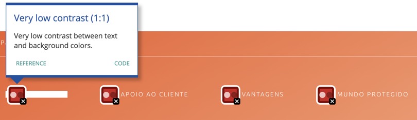
Screenshot of the top menu with very low contrast in a Portuguese insurer website. Source: Ageas
Not underlining links and confusing link text
Here we see an example of how colour can be wrongly used to indicate a link to a page. The word “aqui” (“here”) is a link to webpage. We know it’s a link because is presented in blue. However, using the Web Accessibility Simulator (image on right), we see that someone with total colourblindness can’t tell the difference between the clickable word and normal text. For accessibility purposes, hyperlinks should also be underlined.
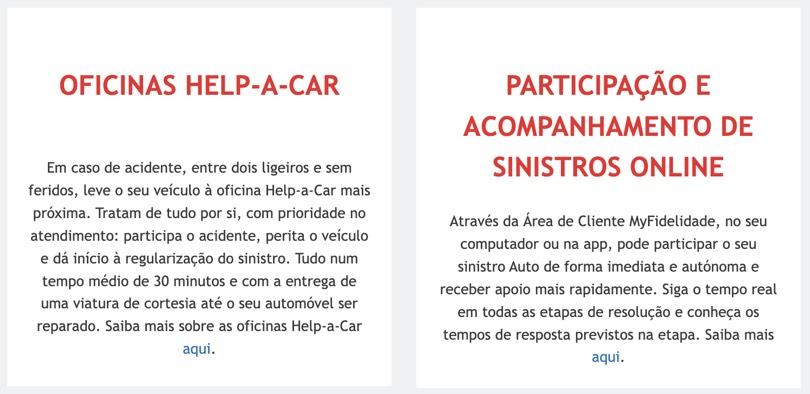
In the same example, we can also witness another accessibility issue with the link “aqui”. Links like “Click here” or “Learn More” can be confusing when a screen reader reads them out of context. To help them navigate, screen reader users can hear a list of links read to them. Without links with descriptive keywords they’ll just listen “link, aqui”, “link, aqui”, “link, aqui”.
Link text should allow them to understand the function and purpose of the link, without the surrounding content.
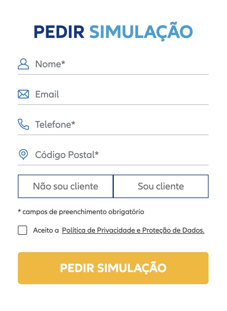
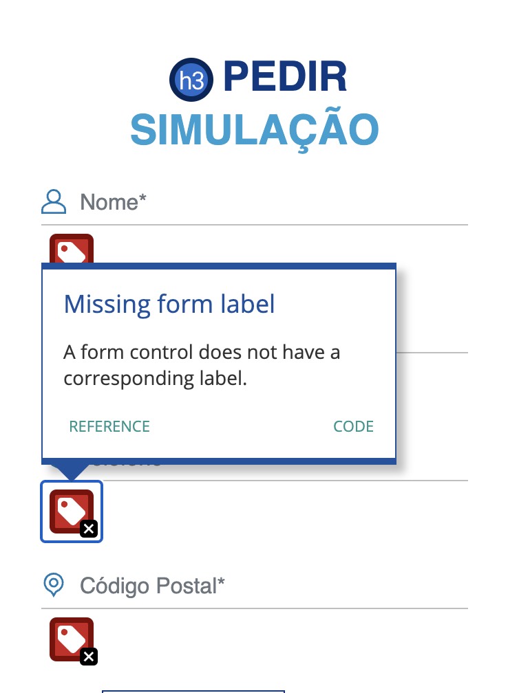
Missing form labels
In this insurer website, to get a quote you need to fill in this simple form. When a form control doesn’t have a corresponding label, the function or purpose of that form control may not be presented to screen reader users.
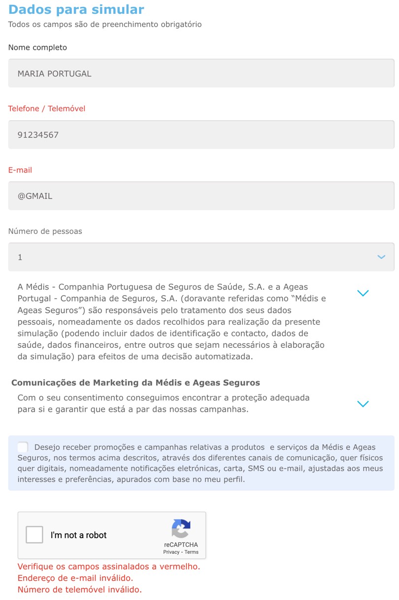
Error messages
To get a quote for a dental insurance you need to fill in the form below. If you miss one of the form fields you get the error message “Check the fields in red”. Well, a customer who is colour blinded will certainly not be able to know which fields the error is referring to. Colour can’t be the only visual clue to identify form fields with errors.
Errors must be clear and informative. The error “Check the fields in red” doesn’t inform users those fields are mandatory in order to proceed.
They might also help the user. Besides saying “Invalid phone number”, you could make an appropriate suggestion. For example, “Invalid phone number. Enter a 9-digit number.”
In this example the errors are displayed at the very bottom of the form. A more accessible practice would be displaying errors close to the element that has failed.
Complex language policies
If insurance policy language and coverage is often a nearly impossible-to-solve puzzle for someone without intelectual disabilities, we can only image how daunting of a task it may be for someone with a disability that affects how well they understand information.
Addressing complex language is an example of something that will benefit both people with and without disabilities.
Speaking in plain language means cutting out all the jargon, and when legal reasons require the use of more complex phrases, explain what they mean in simpler terms. Sentences that run on for paragraphs must be avoided and simpler text can be supplemented by images, graphs and other illustrations.
In a time where people are preferring to buy insurance directly online, rather than resort to middlemen and agents, they end up losing the person who helped them “translate” the conditions of the contract their signing up. Plain language will then help all customers, with a disability or not, to feel more confident when the time comes to make insurance decisions. And possibly, the number of people calling customer service asking for clarifications will decrease.
Towards digital accessibility — a 3-phase plan of action
1º Assessing
The first task should be reviewing your digital products (websites, apps, intranet, etc.). Doing so allows you to find what you’re doing right and identify all accessibility issues.
This accessibility audit can be done both automatically and manually. Although automated validation software can help speed up the auditing process, they can only validate elements that can be tested by a machine, as they verify HTML code and look for known patterns and problems. There’s always verifications that need manual checking. Automated tools can say that all images of a page have a description (alt text), however that alt text might not include a correct description of the image.
Digital accessibility is often complex. For teams without proper accessibility training, assessing a website or app might be a daunting task. Not to mention time-consuming. In such cases, collaborating with an accessibility expert might be a good solution. They’ll have the necessary expertise to point out the errors, and lead your company towards compliance.
2º Fixing
Once you’ve identified WCAG compliance errors it’s time to correct them. You can make a checklist of items that need to be fixed, and start from the simple to the most complex ones.
Once you fixed the accessibility issues it’s time to conduct usability tests with people with disabilities. It’s the best way to get real feedback and ensure the website or app really are barrier-free.
When doing so, try to test with as many different abilities as possible. However, don’t fall for the error of thinking that when you’re testing your website with someone who’s blind, you’re making it work for all people who are blind. While one user might prefer to use JAWS as they preferred screen reader, others use VoiceOver on Mac devices. Also, people with less proficiency navigating the Web will most likely experience different issues.
3º Monitor
Your insurance company must adopt an accessibility-first mindset, where accessibility is always seen as a necessity and not just a-nice-to-have thing.
From stakeholders, to designers, developers, content creators, policy makers, and call-centre staff, everyone must be on-board. Let them know about accessibility concerns and start building internal accessibility knowledge and skills.
Next time you develop a new app or website, accessibility will be considered from the very start. It will be far easier and cost-effective than fixing everything after launch.
There’s no such thing as fixing accessibility issues and you’re done. As you make new additions to your website or app you need to monitor changes and ensure they meet compliance standards.
You’ll also want to value your customers feedback about any accessibility issues they might encounter and make adjustments based on their insights. Several companies provide a direct form of contact for that purpose (Allstate, Progressive, Allianz UK are some examples).
Ensuring digital accessibility to drive success
By not addressing accessibility you’re actively preventing a part of the population from accessing and purchasing your services. A part with spending power, and a potencial revenue you can lose out.
When people look for insurance, they're looking to protect their life, health, family and valuables. They want to feel that they’re getting the best possible deal. Today’s customers are empowered to search online and compare offers by different providers before making a choice. Accessibility can make their online experience easier and more transparent.
The days of ditching accessibility to a second-plan are (or at least should be) over. Providing accessibility accommodations and allowing everyone to access your services is the right thing to do, both ethically and legally.
Insurance leaders must see accessibility as a way to improve the experience for all users, regardless of their abilities. As a result, you’ll not only create more market share, but you’ll stand out and remain competitive in such a crowed industry.
Ready to build a plan and make your insurance website more accessible?
Xperienz performs accessibility audits to access compliance with WCAG guidelines, identifying errors and providing a possible resolution so they can be easily addressed by your team.
We also conduct usability tests with users with disabilities to identify their needs, difficulties or obstacles when navigating your website or app.
Accessibility App by Xperienz
We’ve created an app to help design and development teams understanding and correcting all accessibility issues identified in digital products.
Tell me moreRelated Articles
-
Looking to be EAA compliant? — Don’t fall for easy web accessibility solutions
Choosing an overlay is just a band-aid solution, and shows a true disregard for users with disabilities. Instead, we need to work towards a mentality where websites, apps and other digital products are designed and coded with accessibility in mind from day 1.
-
Prompt-based — The birth of a new human-machine interaction model
The ways humans interact with technology has evolved significantly over the decades — and it’s still constantly evolving. The rise of Artificial Intelligence (AI) and natural language processing (NPL) has brought to light a new way of interaction — prompts.
-
A glimpse into the future — Here’s the UX design trends we expect to dominate 2024
Emerging technologies and tools constantly influence the way people use the Internet and interact with digital products. And as user behaviours and preferences evolve, designers must keep up with new tools and solutions to deliver interfaces and user experiences that cater the needs of an ever-demanding audience.
-
How can insurance companies make their digital products more accessible?
Millions of people who live with a disability struggle to access important information online because websites and apps are built with major content and technological barriers. And insurance websites are not an exception.
-
Barrier-free banking - From branches to mobile apps accessible for all
In the banking and financial industry, accessibility is about empowering everyone, including people with disabilities and the elderly, to enjoy bank's products, services and facilities, by making them convenient and easy to use.
-
Design for a better world - How working together and applying design approaches is improving people's lives
9 November is World Usability Day 2023. This year's theme is Collaboration and Cooperation, which intents to focus on how we can work together to create solutions, both globally and locally, to solve the world's biggest problems.
-
Be an Agent of Change - Check these resources to help you build more ethical designs
The role of today's designer goes far beyond simply creating beautiful interfaces and experiences. You can no longer design without considering the consequences of how what you're creating impacts individuals, society and the world.
-
E-commerce and Accessibility - Creating an inclusive online shopping experience
Now it’s the time for online stores to improve their website accessibility and ensure they offer an inclusive experience for everyone.
-
The future is today — How can we leverage AI to improve our UX Design work
AI has now become a big part of several areas of our lives, and UX Design is no exception. It’s actually becoming more and more applicable to the UX design process.
-
Conducting usability testing with people with disabilities
Drawing on our experience conducting usability tests with users with disabilities, we’re sharing a few things to take into account when planning and conducting research with people with disabilities and make sure everything goes smoothly and you can collect valuable insights.
-
Accessibility Compliance App - by Xperienz. A useful tool when fixing accessibility errors
To simplify the presentation of the accessibility evaluation of websites, Xperienz has created the Accessibility Compliance App. We start by doing a content inventory in which we collect all the pages of the site. Then we evaluate each page and list all the aspects that need to be fixed.
-
What does the UX future hold? - Here's the UX Design trends we expect to dominate 2023
Businesses must stay up to date on emerging user experience and interface trends so we've selected 7 top trends that are already making, and will certainly continue to make, an impact on website and app development.
-
Raising Awareness for Web Accessibility [Infographic] — International Day of Persons with Disabilities
Last December 3 we celebrated the International Day of Persons with Disabilities. To help promote a more accessible Web we’ve put together an easy-to-digest infographic about Web Accessibility.
-
Why hiring external UX services even when you have an in-house UX team?
Even if you have an in-house UX design team, there might be times when additional resources and professional know-how can be useful. Bringing in an external UX team might be exactly what you need for your company to excel in all projects.
-
Health and UX: when design has a life-saving potential
A good experience with healthcare technology and services, that is both useful, accessible and reliable, can make a huge different in improving peoples’ well-being, as well as the work of healthcare professionals.
-
Trust — Breaking or Building it Through Design
Trust is more valuable now than ever. 68% say trusting a brand they buy or use is more important today than in the past (Edelman, 2019). We live in an ever-growing digitalised world, where we increasingly interact and transact online. At the same time we constantly crave for trust-based interactions in digital environments. Questions like "Will the personal data I provide here be misused?", " Will my email be used to spam me incessantly?" or "Do I really want to share my bank details to a website I've never heard about?" have certainly come to our mind more than once.
-
Innovation Sprint — Exploring and validating a business direction in 2 to 4 weeks
During an Innovation Sprint, a new method created by Xperienz, the Sprint team joins efforts with the organisation team and in 2 weeks (minimum) they identify three strategic business directions, taking into account the organisation’s current state and structure. These innovative ideas are prototyped and tested and in the end the organisation will know the best path to follow.
-
Creating accessible digital experiences
Accessibility is of major importance for organisations who deliver web products and tools. Accessibility issues can affect not only a website’s usability for people who have disabilities but also for those who don’t. By offering accessible products, organisations will show they are inclusive, reach a wider market, be legally compliant, and offer a better user experience. For everyone.
-
Quick & Dirty User Research
Tight timescales and budgets are no excuses to ditch user research altogether, specially when we all know it’s essential to make sure you deliver easy-to-use products. Quick and dirty research is a great way to get user insights fast and on a budget.
-
10 Bad User Research Practices You Will Want to Avoid
Some might think user research is as simple as watching people perform a few tasks on a website or asking them a few questions, but user research is definitely not walk in the park. Let’s go through some of the mistakes that can arise when planning and conducting research.
-
Responsive Illustrations
Can the same illustration be used the same way on a desktop screen, on a tablet or on a smartphone? How is it possible to make them look great on every screen without losing quality or the idea the brand is trying to convey?
-
UXLx Masters — Wrap-up
From 10 to 13 February attendees from 25 countries and 14 world-renowned UX experts joined online for 3 days of learning. The programme included 12 live masterclasses, 2 keynotes, 2 live podcasts, and more.
-
The Design Role in Digital Transformation
As the world keeps evolving and digital becomes more crucial to our everyday life, companies are feeling pressured to keep up and level up their game.
-
Why We Need Parametric UI Design Tools
In Design, parametric refers to a process based on algorithmic thinking that uses parameters and their interrelations to define a geometric form (which can be buttons, containers, panels, etc.).