Responsive Illustrations
February 25, 2021
More and more of us are browsing the web on our phones. Most of the times is just more convenient than sitting down at a desktop or laptop computer. And the data confirms it — mobile accounts for approximately half of the web traffic worldwide. In the third quarter of 2019, mobile devices (excluding tablets) generated 51.5% of global website traffic (source: Statista).
As people increasingly started to use a diversity of devices to browse the web, designers realised the days of designing a website for a single desktop screen were over. So they had to re-thinking how their designs were displayed across different devices. That brings us to the concept of responsive design, which we’ll cover in the first part of this article.
Then we want to focus particularly on responsive illustrations. More and more designers are taking advantage of custom illustration work on the websites they create. And why shouldn’t they? Good illustrations are not only a feast for the eyes, they can help users better understand the brand’s message. They certainly look better than some random stock photos that we recognise from seeing on another website.
Can the same illustration be used the same way on a desktop screen, on a tablet or on a smartphone? How is it possible to make them look great on every screen without losing quality or the idea the brand is trying to convey? Let’s see.
First things first — what’s responsive design?
If designers and developers had to build countless versions of a website for every known device there is, it would be impractical both time and cost-wise. Responsive web design (or mobile-friendly design) is an approach that allows design and code to respond to the size and orientation of a device’s screen. Responsive websites essentially use fluid grids, flexible images and CSS styling to change the site’s design and render it according to the width of the viewing screen.
Responsive web design means that the page uses the same URL and the same code whether the user is on a desktop computer, tablet, or mobile phone — only the display adjusts or responds according to the screen size.
And why is it important?
A need for speed
Although more than half of the global population is currently connected to the internet (according to Statista, as of October 2020, almost 4.66 billion people were active internet users, which encompasses 59% of the global population), internet speed is still quite slow in many parts of the world. Responsive design plays an important role in the optimisation of websites for speed. That’s relevant when 1 in 4 visitors would abandon a website if it takes more than 4 seconds to load. As a consequence, it will negatively affect conversions.
Search engine stardom
Speed is also crucial when search engines demote websites that don’t load quickly, both on desktop and mobile searches.
Since April 2015, Google has introduced responsive websites to their ranking criteria. That’s of major importance when it comes to SEO (Search Engine Optimisation) and if you want your website to secure a spot on the top results displayed to users. And as we know, high Google rankings drive much more traffic and possibly more conversions.
User-friendliness
An Adobe study concluded that users prioritise display and design when viewing content across their personal and professional lives. In fact, they consider that “content that displays well on the device they’re using” is the second important aspect when is comes to the content viewing experience. Also, they will switch devices or stop engaging content altogether if they encounter design or display issues.
When a website isn’t mobile-friendly images might appear distorted, text is too small and hard to read, or doesn’t fit the screen at all, information is difficult to find. Having a website optimised for mobile can make a huge difference, specially when we know that 67% of mobile users say they’re more likely to buy a site’s product or service when the site is mobile friendly.
To mobile-optimise websites and meet user needs, there are a series of best practices designers and developers should take into account. They concern, for example, clickable areas, buttons, content, imagery and typography. But today, we want to focus on a particular one — illustrations.
Responsive illustrations — what are they and how do they work?
Illustrations have become a key web design trend, and one that’s definitely here to stay. However they are more than just decoration to make a website’s layout look nice. The best illustrations are those who enhance both the website’s content and the brand message. They are incredibly effective to engage visitors and add a human touch to the overall experience.
If we think that 94% of first impressions are design-related and 38% of people will stop engaging with a website if the layout is unattractive, then creating an aesthetically beautiful website, taking advantage of illustration, must be a priority to leave a lasting impression on users.
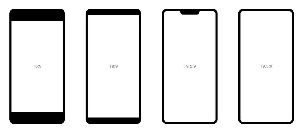
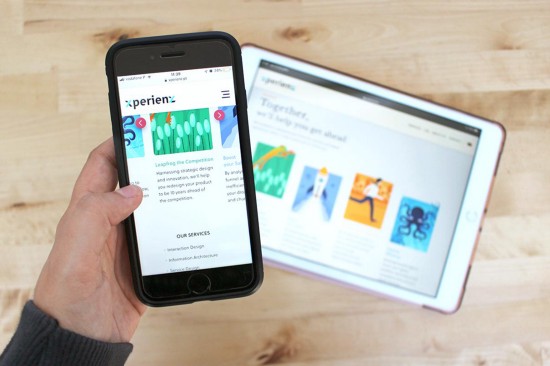
Designing responsive illustrations comes also from the need to adapt to mobile phones with quite different screen ratios.
When designing a responsive website, designers need to think about how an illustration will scale. How will it look on a large desktop screen, on a tablet or a small mobile screen?
The secret: SVGs
SVGs or Scalable Vector Graphics are essential for any responsive design that uses illustrations or icons. When you create a JPG in Photoshop, for example, the file is exported as a fixed set of pixels, which can make logos or illustrations lose quality and appear pixelated or grainy when scaled up. Unlike image files in JPG and PNG format, SVGs are infinitely scalable.
SVGs are resolution-independent because they’re a vector format constructed using a mathematical equation that allows images to scale in size without losing quality. With SVGs the final product uses XML format, which is a collection of code. Since an SVG is a vector base graphic, it will scale any size to fit different size devices. So by using an icon or graphic in SVG, you know it will remain pixel-perfect across all experiences. For that reason, SVGs are a huge time saver as you don’t have to design multiple versions of an illustration to fit different screens.
Then there’s the speed factor. We all know it’s pretty annoying when we’re sitting on our phones and watch an image buffer because of how large it is. SVGs often have a smaller size file, which helps websites load faster.
Let’s take a look at this example
To be responsive, this illustration of a man and woman in an office setting is built in 3 layers — background, person 1 and person 2 — each layer corresponding to a different SVG file.
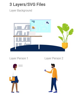
With a responsive approach, the illustration increases proportionally. However, in order for the illustrations of the two persons to be framed on the screen, the “Person 1” and “Person 2” layers move to the centre of the screen.
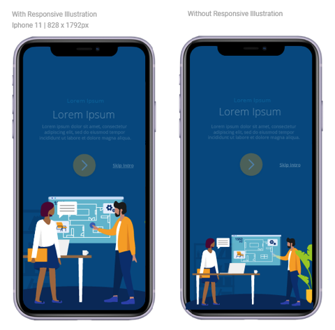
If you we don’t use a responsive approach the illustration will appear small or important parts of the image will be the ones to be slightly cutoff. By using a responsive approach we will keep the important elements of the foreground, and the less important elements in the background will disappear.
In the responsive approach, we might not see some elements of the background layer when using a mobile device, however that doesn’t affect the idea the illustration is trying to convey because the important elements of the foreground are well framed.
The illustration we see in the non-responsive approach would probably make more sense in a tablet or desktop screen which are big enough for us to see more details.
Who’s nailing it
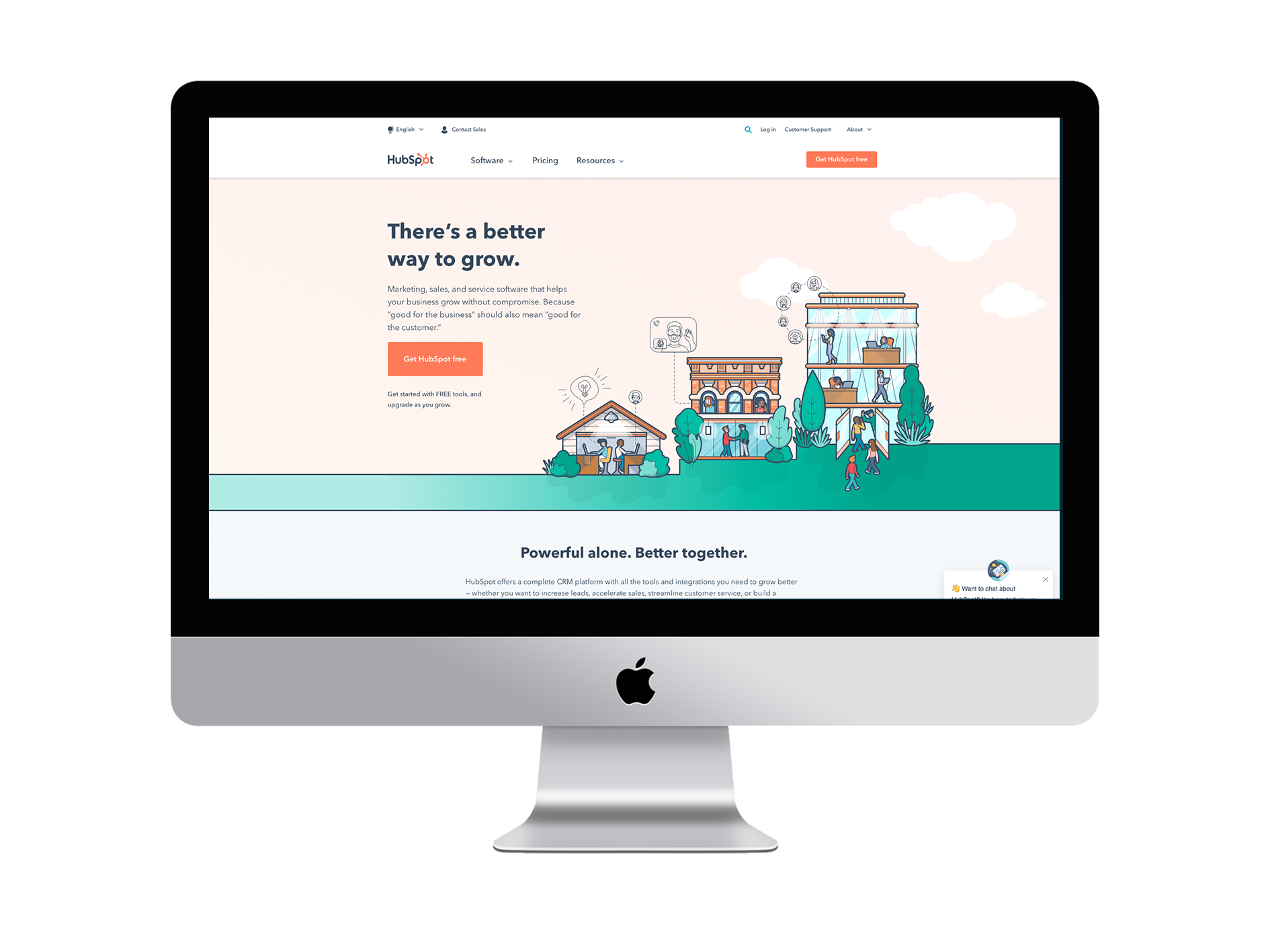
HubSpot’s homepage strongly relies on illustrations. If they had been saved in PNG format, their size would be quite bigger, due to all the details, the amount of colours used and the large dimensions. That would result in more loading time and poorer quality.
When comparing the homepage illustration in both desktop and mobile devices, we can see that instead of having the same illustration sized down to fit the smaller screen, two of the buildings disappear and only one is included.
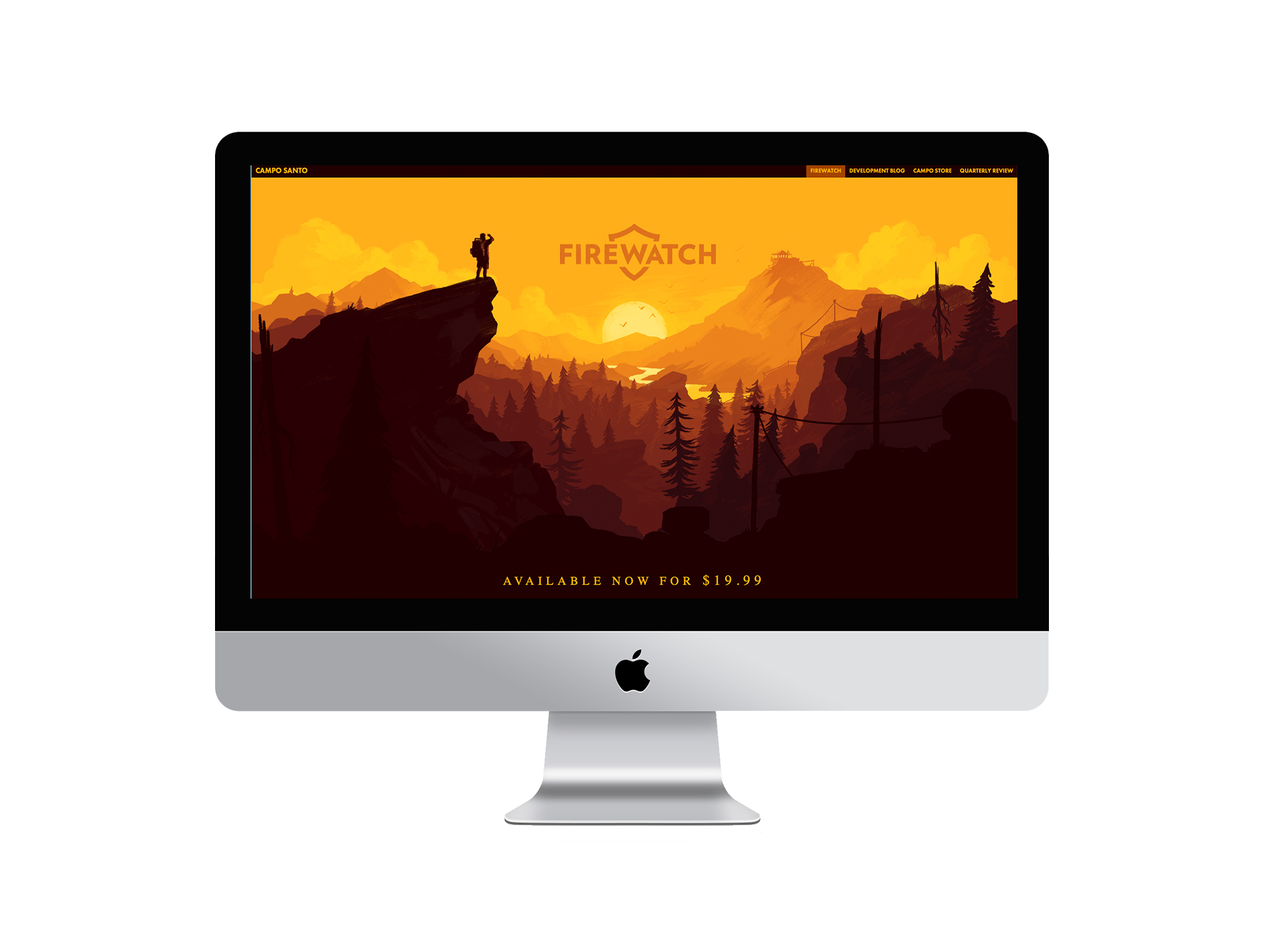
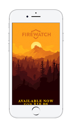
The Firewatch videogame website uses amazing background illustrations. We can clearly see how the illustration adapts to a smaller screen size.
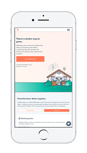
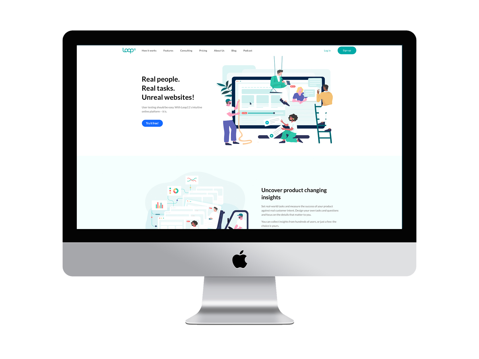
Another great example is Loop11. This is how the illustrations on their homepage look like:
When we see their website on our mobile, this is what we get:
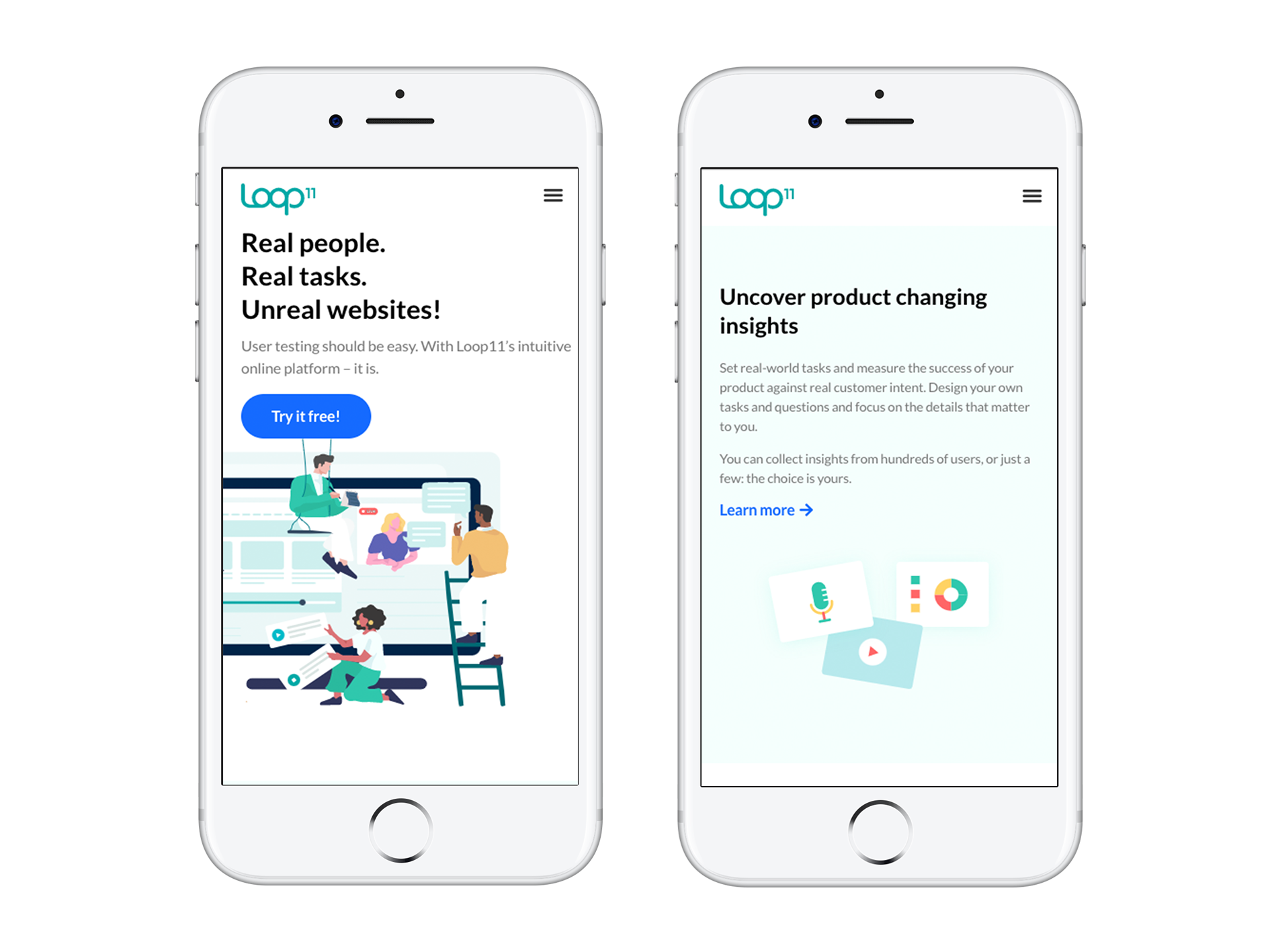
We can see that the first illustration decreased proportionally. The man on the right disappeared but that didn’t affected the idea they’re trying to illustrate. The second illustration we see on the desktop screen loses the lifter element and focuses only on the icons.
Illustrating all the way (and for all devices)
It is no longer enough to have a static website that only works well in desktop screens. If a big part of your visitors are accessing your website through a mobile device, a page designed for a desktop will simply not do the trick. Mobile website traffic has never been so important. Businesses who don’t have a website compatible with mobile devices are likely losing a high number of potencial customers to their competitors.
When it comes to illustrations, they can do a great job in representing brands on their websites, helping users understand content in both a unique and engaging way. Surely seeing an illustration in a desktop screen and on our mobile is clearly different. On a wider screen, we’ll be able to perceive details in a way that we’ll not in a smaller one. That’s why it’s crucial that illustrations, along with all the other elements of an interface (menu, buttons, text, etc.), can adjust to whichever device each user decides to open a website on.
Nearly 8 in 10 of consumers would stop engaging with content that doesn’t display well on their device (source: Adobe). That’s why designing a website for varying devices and screen sizes is critical. Responsive illustrations and overall page design are about optimising the experience for everyone, no matter the device they’re using. That will result in higher conversion rates, higher leads and business growth.
Want a website that works well across any device?
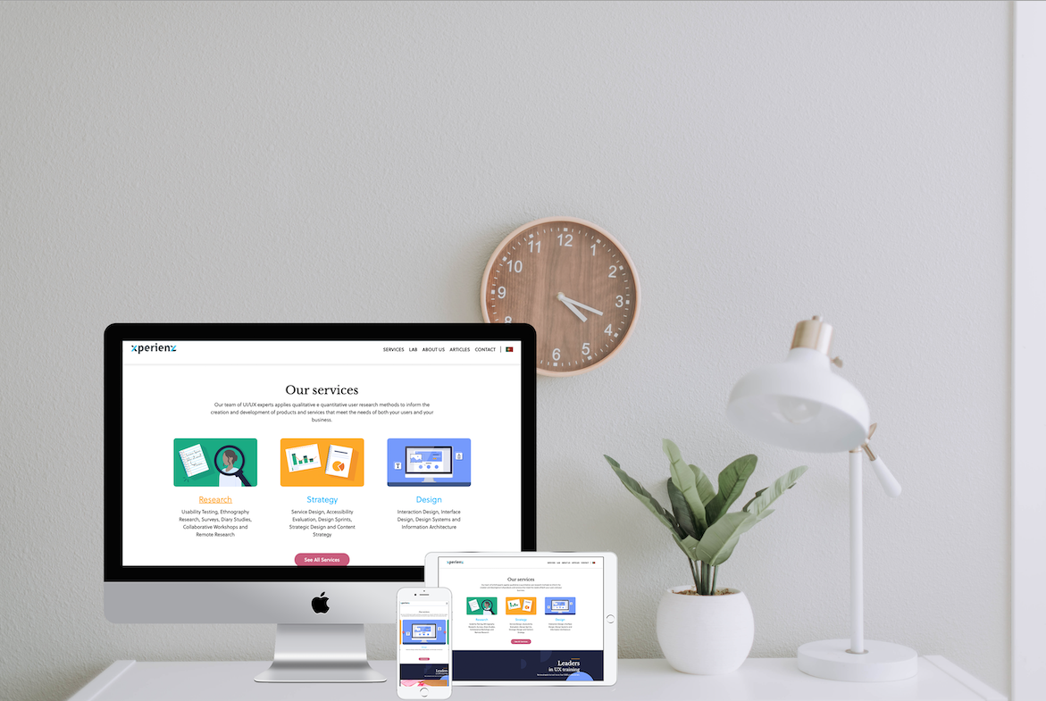
At Xperienz, by taking a responsive design approach, we make sure your organisation’s website provides a great user experience across any device — smartphones, tablets and desktops.
Tell me moreRelated Articles
-
Looking to be EAA compliant? — Don’t fall for easy web accessibility solutions
Choosing an overlay is just a band-aid solution, and shows a true disregard for users with disabilities. Instead, we need to work towards a mentality where websites, apps and other digital products are designed and coded with accessibility in mind from day 1.
-
Prompt-based — The birth of a new human-machine interaction model
The ways humans interact with technology has evolved significantly over the decades — and it’s still constantly evolving. The rise of Artificial Intelligence (AI) and natural language processing (NPL) has brought to light a new way of interaction — prompts.
-
A glimpse into the future — Here’s the UX design trends we expect to dominate 2024
Emerging technologies and tools constantly influence the way people use the Internet and interact with digital products. And as user behaviours and preferences evolve, designers must keep up with new tools and solutions to deliver interfaces and user experiences that cater the needs of an ever-demanding audience.
-
How can insurance companies make their digital products more accessible?
Millions of people who live with a disability struggle to access important information online because websites and apps are built with major content and technological barriers. And insurance websites are not an exception.
-
Barrier-free banking - From branches to mobile apps accessible for all
In the banking and financial industry, accessibility is about empowering everyone, including people with disabilities and the elderly, to enjoy bank's products, services and facilities, by making them convenient and easy to use.
-
Design for a better world - How working together and applying design approaches is improving people's lives
9 November is World Usability Day 2023. This year's theme is Collaboration and Cooperation, which intents to focus on how we can work together to create solutions, both globally and locally, to solve the world's biggest problems.
-
Be an Agent of Change - Check these resources to help you build more ethical designs
The role of today's designer goes far beyond simply creating beautiful interfaces and experiences. You can no longer design without considering the consequences of how what you're creating impacts individuals, society and the world.
-
E-commerce and Accessibility - Creating an inclusive online shopping experience
Now it’s the time for online stores to improve their website accessibility and ensure they offer an inclusive experience for everyone.
-
The future is today — How can we leverage AI to improve our UX Design work
AI has now become a big part of several areas of our lives, and UX Design is no exception. It’s actually becoming more and more applicable to the UX design process.
-
Accessibility Compliance App - by Xperienz. A useful tool when fixing accessibility errors
To simplify the presentation of the accessibility evaluation of websites, Xperienz has created the Accessibility Compliance App. We start by doing a content inventory in which we collect all the pages of the site. Then we evaluate each page and list all the aspects that need to be fixed.
-
What does the UX future hold? - Here's the UX Design trends we expect to dominate 2023
Businesses must stay up to date on emerging user experience and interface trends so we've selected 7 top trends that are already making, and will certainly continue to make, an impact on website and app development.
-
Raising Awareness for Web Accessibility [Infographic] — International Day of Persons with Disabilities
Last December 3 we celebrated the International Day of Persons with Disabilities. To help promote a more accessible Web we’ve put together an easy-to-digest infographic about Web Accessibility.
-
Why hiring external UX services even when you have an in-house UX team?
Even if you have an in-house UX design team, there might be times when additional resources and professional know-how can be useful. Bringing in an external UX team might be exactly what you need for your company to excel in all projects.
-
Health and UX: when design has a life-saving potential
A good experience with healthcare technology and services, that is both useful, accessible and reliable, can make a huge different in improving peoples’ well-being, as well as the work of healthcare professionals.
-
Trust — Breaking or Building it Through Design
Trust is more valuable now than ever. 68% say trusting a brand they buy or use is more important today than in the past (Edelman, 2019). We live in an ever-growing digitalised world, where we increasingly interact and transact online. At the same time we constantly crave for trust-based interactions in digital environments. Questions like "Will the personal data I provide here be misused?", " Will my email be used to spam me incessantly?" or "Do I really want to share my bank details to a website I've never heard about?" have certainly come to our mind more than once.
-
Creating accessible digital experiences
Accessibility is of major importance for organisations who deliver web products and tools. Accessibility issues can affect not only a website’s usability for people who have disabilities but also for those who don’t. By offering accessible products, organisations will show they are inclusive, reach a wider market, be legally compliant, and offer a better user experience. For everyone.
-
Quick & Dirty User Research
Tight timescales and budgets are no excuses to ditch user research altogether, specially when we all know it’s essential to make sure you deliver easy-to-use products. Quick and dirty research is a great way to get user insights fast and on a budget.
-
UX Writing — Create better experiences with better content
Imagine a website or an app with no words. If it wasn’t for the logo, would you be able tell what this page is about? Would you know which button to click? Where navigation would take you? What you’re supposed to write in the search bar? No matter how good-looking an interface is, without words users will simply not be able to accomplish any tasks in it.
-
10 Bad User Research Practices You Will Want to Avoid
Some might think user research is as simple as watching people perform a few tasks on a website or asking them a few questions, but user research is definitely not walk in the park. Let’s go through some of the mistakes that can arise when planning and conducting research.
-
Responsive Illustrations
Can the same illustration be used the same way on a desktop screen, on a tablet or on a smartphone? How is it possible to make them look great on every screen without losing quality or the idea the brand is trying to convey?
-
UXLx Masters — Wrap-up
From 10 to 13 February attendees from 25 countries and 14 world-renowned UX experts joined online for 3 days of learning. The programme included 12 live masterclasses, 2 keynotes, 2 live podcasts, and more.
-
The Design Role in Digital Transformation
As the world keeps evolving and digital becomes more crucial to our everyday life, companies are feeling pressured to keep up and level up their game.
-
Why We Need Parametric UI Design Tools
In Design, parametric refers to a process based on algorithmic thinking that uses parameters and their interrelations to define a geometric form (which can be buttons, containers, panels, etc.).